---- Color theory & Typography ----
Color theory is the art and science of creating appropriate color pallet for your website or application.
Color Theory
Before starting let's see how important it is to choose a color according to the requirements.
-
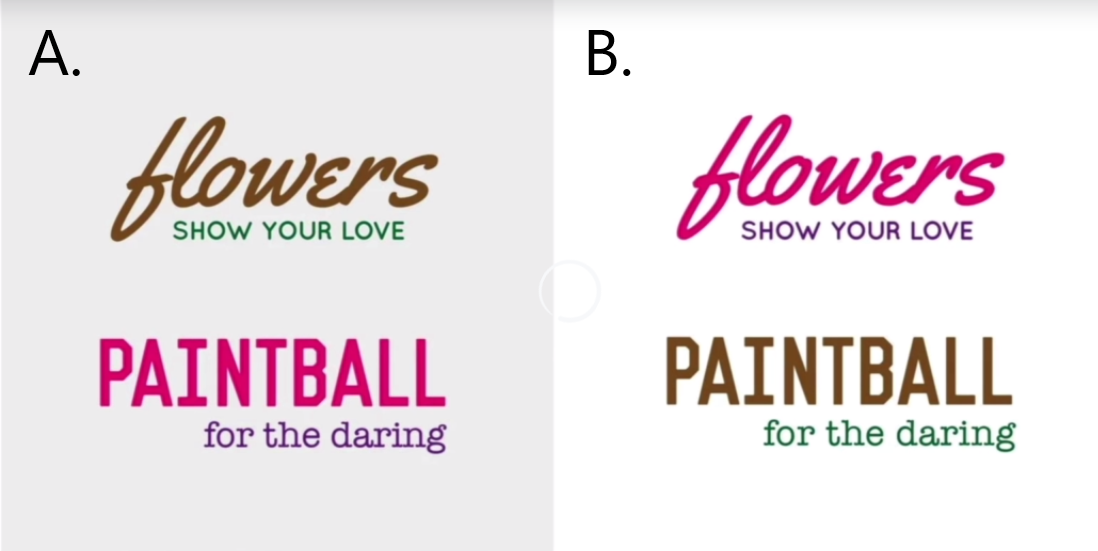
Look at the picture below, on left we have picture "A" where color of flower looks a bit like dirt, but it also looks like something else 💩. Plus paintball being pink I am not really sure who that target audiences.
-
On the other hand if we flip the colors as shown in picture "B", it suddenly looks like as it is meant to be. It looks a lot better and consistent with the actual message.
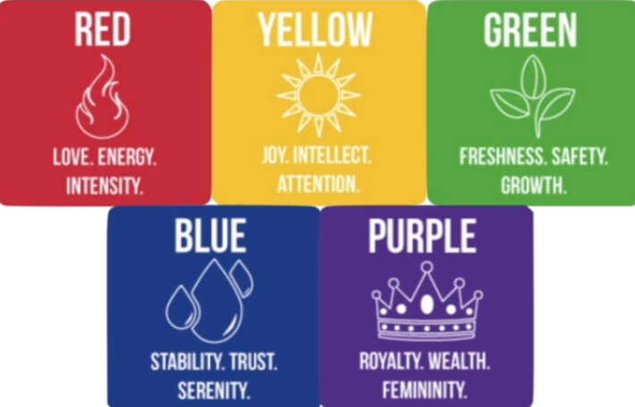
Moods
So when you are picking a color pallet you must be aware of mood of color pallet. The predominant color that is going to be in your design really conveys a message. Here is a whole set of colors below which resemble a specific mood.
Combining Colors
You are not gonna be using a single color for your design. You are probably gonna be using 2 or 3. So at some point you have to decide which different colors to combine. This is probably the most scientific part of color theory
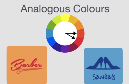
1. Analogous Colors
Two colors that are next to each other on color wheel.
These designs look very much harmonious. This color pallet is very good for things like
navigation bar, body of your website or things like a logo and its background.
One thing which it is not good at is standing out, if you really want your design to pop.
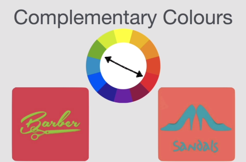
2. Complimentary Colors
Two colors that are opposite to each other on color wheel.
If you really want your design to pop than you should use complimentary colors.
This pallet really creates that pop.
*Avoid designing text with complimentary colors keep it to things like logo or icons.
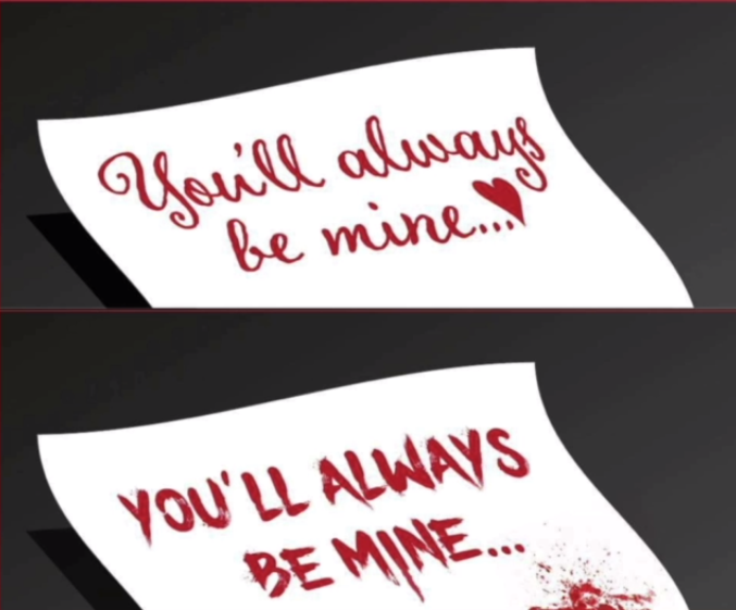
Typography
Why typography is important?
See example below
Let's say it is valentine day and you want to write a letter to your beloved valentine. If yo choose font on top, there is a probability that he/she will like it. But if you choose the wrong font (let's say lower one) then it might put you in bit of a problem.